Design Systems in iOS
In SATS we just made open source the package for our iOS design system: SATSCore-iOS. I want to explain how we work with it in the SATS members app.
Since we still support iOS 12, then we write a lot of UIKit. While we use SwiftUI more and more, we still want to support both existing and new UIs with the same style. After a long period of the app being developed we decided to unify and create a more solid UI foundation for our UIKit code, but also think about the future when we will develop in SwiftUI.
When writing UIKit, you deal with a very verbose API versus that of SwiftUI. We want our basic building blocks to contain the right configuration for our default styles, so we don’t repeat the same settings across the app. Building UI by composing simple components is quite efficient and helps to create UI in isolation as I explained in Building testable views with UIKit. Having good base components also helps us ensure the proper support for system features like: dynamic type and dark mode.
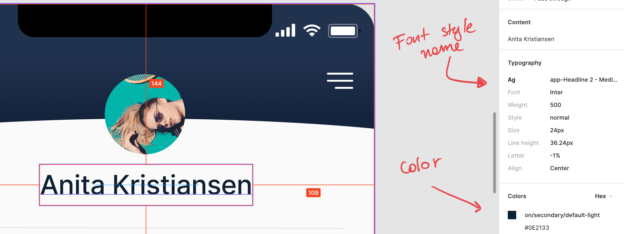
Having a design system is a good idea that will increase the development speed as the developers don’t need to make decisions when inspecting a label in the design tools (we use Figma). We can simply see: this is a basic label with the default text color, completely disregarding the details of the font used, the font size, the hex value of the color and so on. This way of working also promotes that our design is more uniform and changes in this basic components will reflect across the app when needed.
In my previous job I used to work in Finn.no where I was part of the development of FinniversKit, Finn.no’s design system. That experience helped me understand the power of design systems when building UI for iOS and how much code and reasoning it saves. On the other hand, since SATSCore-iOS was created after the release of SwiftUI, we could more easily consider the SATS design system implementation to work both with UIKit and SwiftUI.
Our open source package SATSCore-iOS is intended to be used mainly for reference purposes, as we are required to keep some assets private (in a private sub-dependency), as well the fact that designs systems are very tied to given applications/companies.
Components of a design system
We organize the SATSCore-iOS package with the following directories:
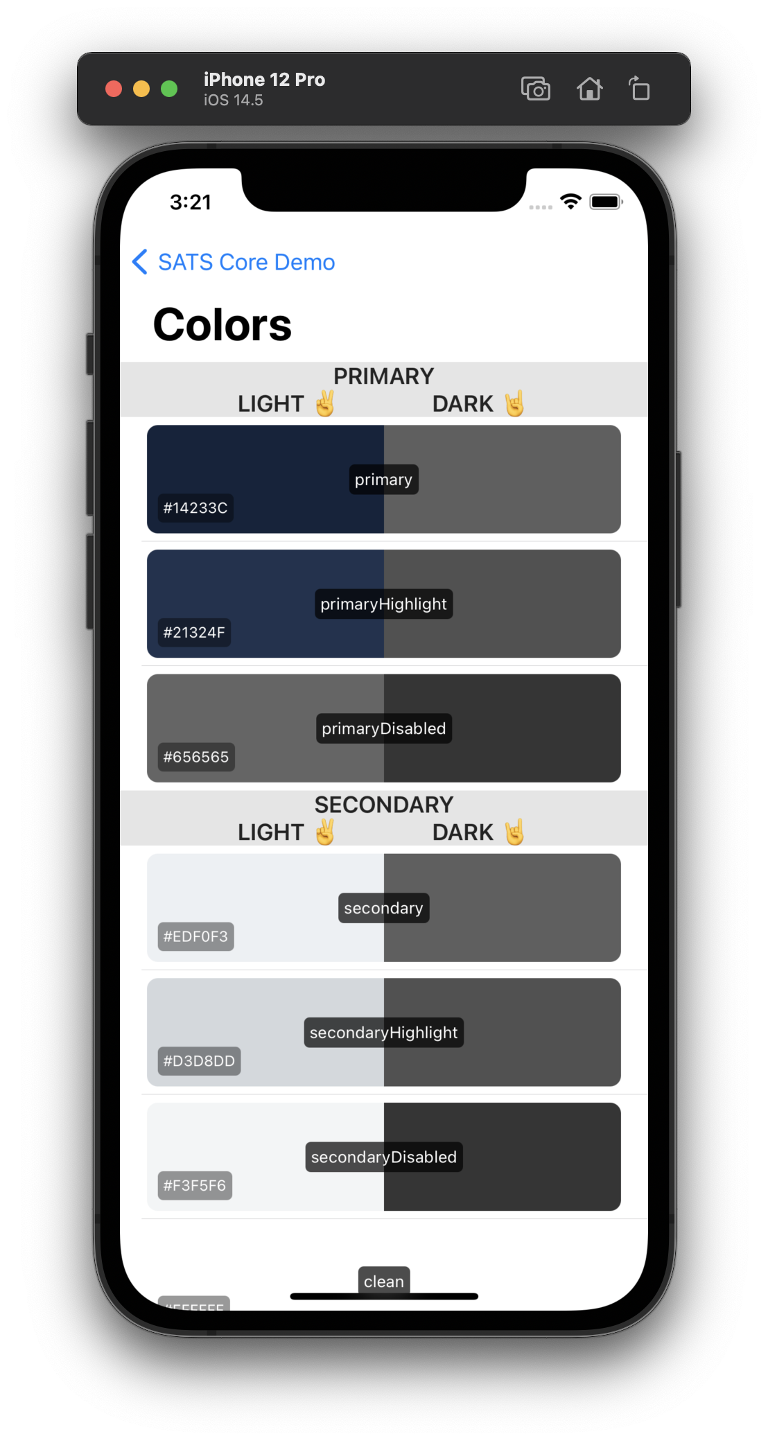
- DNA: intended for the configuration of colors and fonts. The main essence and personality of our design system.
-
Basic Components: buttons and labels that use the DNA colors. In here we define the label and button styles that we will use across the app. We use the names
SATSButtonandSATSLabelasButtonandLabelare used in SwiftUI already.It’s worth mentioning that we intentionally use
structs instead ofenums to define these styles. This choice allow us to create styles outside the package if we need a custom style for a specific screen. - Components: a simple collection of basic UI components like: error views, empty states and so on. Here we create the components that encapsulate common patterns used across the app. Similar on how you build UI with SwiftUI, these components are just compositions of reusable components.
- Extensions: in any iOS app, we developers tend to have a collection of convenient extensions. We place these extensions in this package to ensure they are always available when creating UI. We do not create extensions in here that are not UI related.
Demo App
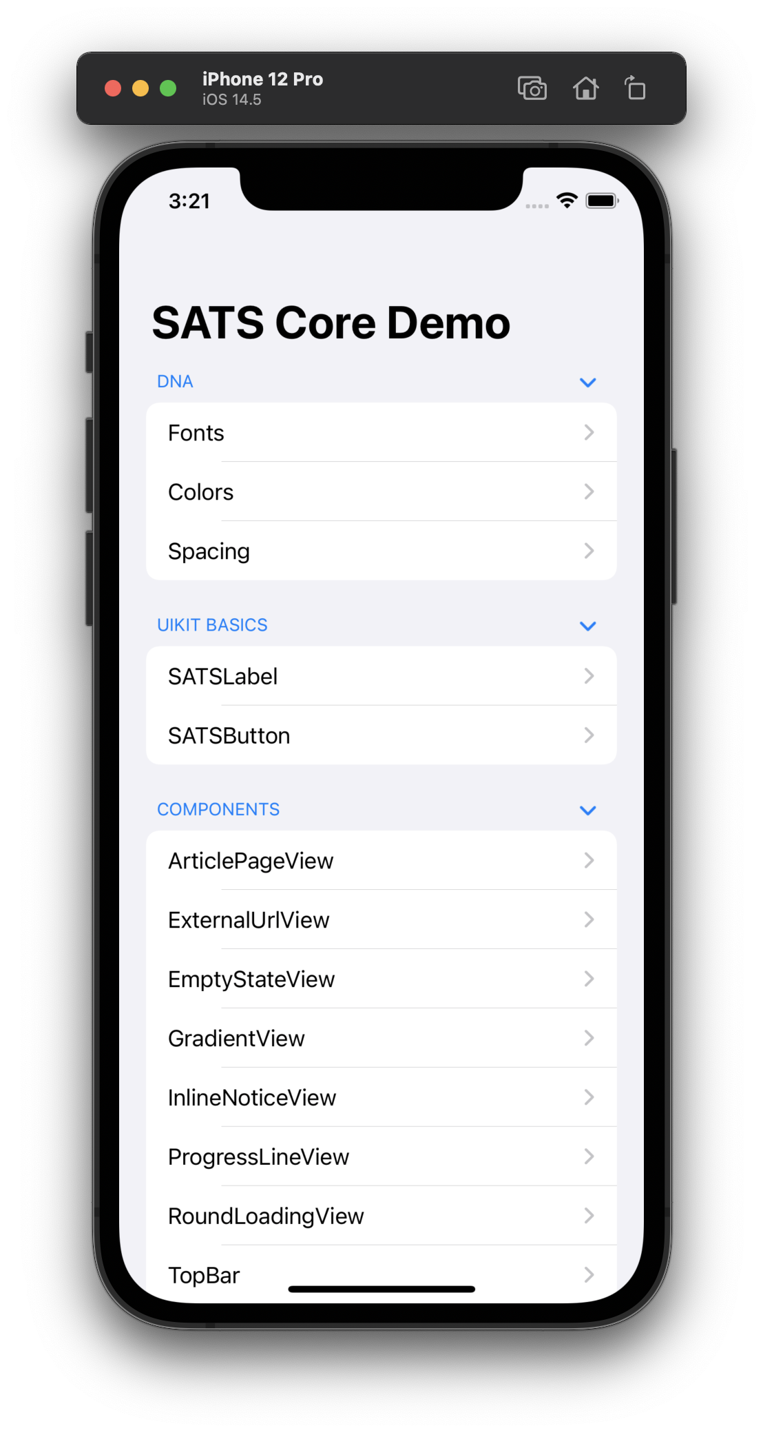
A good way for developers, designers and other team members to see what components are available in the design system implementation is to create a demo app. In this application we list all the component and sections we have available. We also provide with an environment where we see how the UI will be rendered on device and how it will react to dynamic type and dark mode.
We use the Swift Package Manager to integrate this code into our main app and SPM packages cannot contain full-blown apps. We work around this issue by having the demo app in a subdirectory of the package and having the demo app depend on the SATSCore package.
Then, when working on the package we don’t open the package itself in Xcode, but the nested DemoApp.xcodeproj instead, by running:
~/Code/SATSCore$ xed DemoApp
The app looks something like this:
|
|
UI development workflow
Given that in SATSCore-iOS we can find all the elements and setup we need to create UI for the app, we tend to create it within the demo app, even if it’s not intended to live in the SATSCore package with the following steps:
- Create the UI within the demo app: by composing common components to form the desired layout.
- Test the UI in different setups like: iPad, iPhone 8, different accessibility settings, dark mode, etc.
- Move the code to the main project.
The reason to work like this, it’s because we are compiling a way smaller project (than our main app) and we have in a simpler setup in terms of navigation and dependencies, we can iterate way faster than if we would start in the main app.
The smaller project also means that Xcode previews work correctly and just the fact that we develop the UI in isolation ensures we don’t couple it with non-UI code from the rest of the app.
We hope this package is helpful as a reference and inspiration. If you have questions about it you can tweet us to @TechSats.