Using data science to help our members succeed with their training
We recently launched a seemingly small feature in the app which both exemplifies how we work together in the SATS digital department, and how we as a company work towards our vision. The “Group exercise seat probability” (or “GX prediction”, for short) was piloted on a group of clubs in Sweden in the spring, and put into production this autumn. The result? 3200 more members showed up to our group exercises in August! The work was done as a combined effort by our designers, app developers, backend developers and data scientists, and showcased what we can do as an in-house digital department.
The GX load factor challenge
In order to understand the new feature, a quick lesson on SATS’ group exercise (“GX”) offering is needed: SATS’ group exercises is a core part of our offering, and the quality of both the group exercise content and our instructors are second to none. The members who find a group exercise they enjoy tend to keep attending them, so we are eager to have as many of ours members as possible to try them. Many of our classes are extremely popular and have, for obvious reasons, a limited number of seats available. This means that it in many cases, more people want to participate than there are seats available, and the waiting list becomes long (it is not uncommon for there to be 50, 60 and even 70 people on the waiting list). Once the class starts, however, many of the people in the waiting list have found other classes to attend (or have decided against attending) and unbooked their seat and for whatever reason some of the members who did get a seat in the class fail to show up. There is, in other words, usually a seat or two available once a seemingly full class starts. In internal SATS terminology, the load factor of the GX class was rarely 100%, despite what the waiting list might show a day or two before the class’ start time.
The end result, especially for our newer members who are unaware of this trend, is that classes look more than fully booked in our app, discouraging any further booking. We wanted to fix this, to nudge our members to both book a seat and show up to the classes they want to participate in, regardless of the discouraging waiting list. There are, however, some classes which are always completely full (typically those with a very limited number of seats), so we needed a mechanism to warn that in those cases, full actually means full.
We came up with an algorithm which uses historical data for the club, group exercise type and time of day into consideration, and were able to fairly accurately “predict” whether a class’ load factor would, in fact, be 100%. Our first prototype was a green/yellow/red indicator which was quickly scrapped (after all, what does it mean to have a “medium chance” of getting a place?) and replaced with a “high chance”/”low chance” text added to the class booking screen in our member app.
Once we were happy with both the algorithm and how it was displayed in our app, we started a pilot in the greater Stockholm area. The idea was to understand whether the changes to the app actually changed user behavior - i.e. would more people attend GX classes in the pilot clubs compared to other clubs?
The SATS data team’s statistical approach
This is how our data analysts used their big brain power, and quite a bit of statistical prowess, to figure out if we had managed to improve the GX load factor with our app UX adjustment:
When doing analysis of statistical experiments, it is often not possible to get randomized control and treatment groups for the comparison of an experimental effect. Sometimes for legal or ethical reasons, other times simply because the analyst is inheriting an existing setup and must find an answer to a pre-determined question.
In these cases, quasi-experimental methods such as difference-in-differences, matching, instrumental variables, or regression discontinuity design are valuable tools for finding experimental impact free of confusion or causal effects by using criterions selected by the researcher.
Using the difference-in-differences method
The method utilizes existing circumstances in which treatment assignment has a sufficient element of randomness and constructs a control group, as similar as possible to the treatment group. It takes the before-after difference in treatment group’s outcomes, controlling for factors that are constant over time in that group. Then, to capture time-varying factors, the method takes the before-after difference in the control group, which is assumed to be exposed to the same set of environmental conditions as the treatment group. Finally, subtraction of the second difference “washes out” all time-varying factors from the first difference. This leaves us with the impact estimation – or the difference-in-differences.
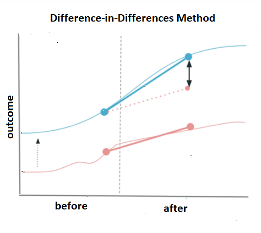
Therefore, the difference-in-differences method (DID) requires data on outcomes in the group that receives the treatment and the group that does not – both before and after the program, and relies on assumption of equal trends for both groups. If the trends moved in parallel before the experiment began, they likely would have continued moving in tandem in the absence of the program. And if this changes after, it indicates the efficiency.
Verifying the pilot results
To check the efficiency of the pilot, we used GX booking data of comparable clubs of the same size and from the same area, which did not participate in the trial. The average Load Factor of the classes for both groups was calculated two months before and two months after the start of the program. The observed load factor level of the control group was lower, but luckily, the groups exhibited the parallel trends, making the application of the DID method possible.
If the pilot was successful, the existing difference between the groups before the pilot would increase as a result after of the pilot intervention and would be statistically trustworthy.
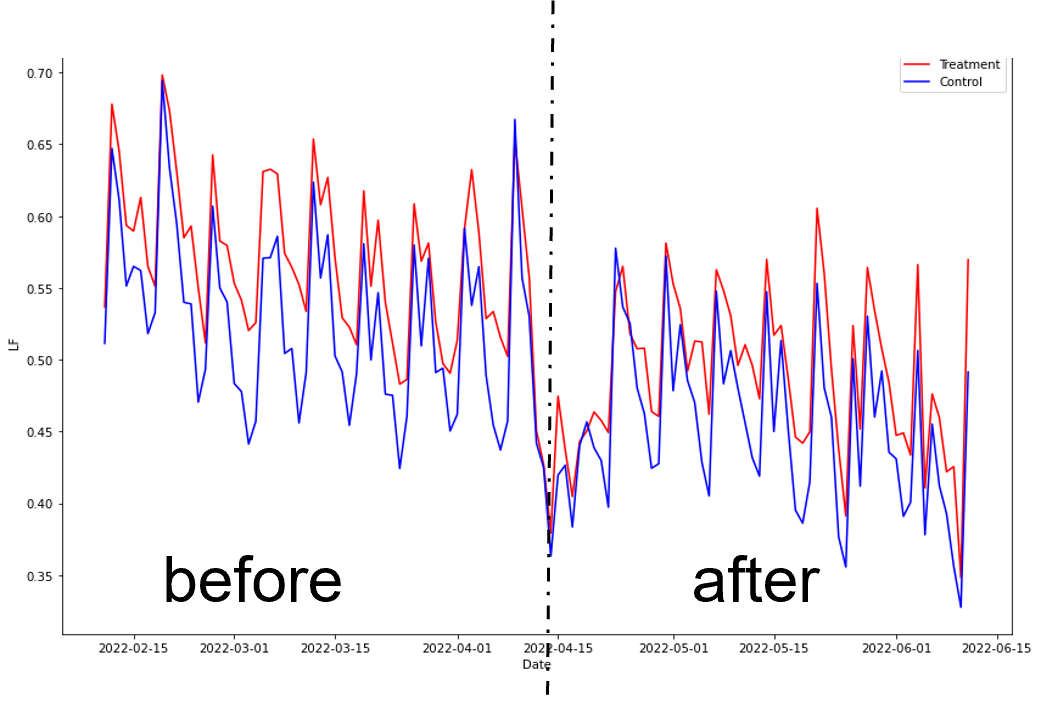
From the time series plot it is difficult to see any difference as it is noisy and diluted by seasonality. Also, unfortunately the trial was launched close to Easter (a major off-peak week), which is why it breaks dramatically in the middle.
A regression analysis model is used to estimate the DID between the average load factors (ALF) of the groups and its statistical significance, controlling for group fixed effects.
Y = α + β1(treatment) + β2(time) + β3(treatment∗time) $
Below is the results of the regression:
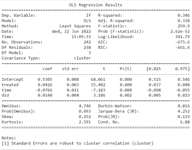
The statistics strongly shows that the ALF is decreasing in time, which is standard seasonal effect of the coming summer. But being in trial treatment is also increasing ALF, which is good. And the best observation is that combined effect of the time and the treatment is positive and statistically significant. The results show with very high probability that the trial was successful. It can be expressed in numbers too. The estimated mean difference in ALF between the treatment and control group prior to the trial was 4%. The effect of the summer on both groups is -8%. The estimated DID in ALF between groups from before to after is 1.4%. So, the total estimated mean difference in ALF between the groups after the trial becomes 5.4% which includes 32% of increase from the original gap.
By removing the seasonal noise from the time series data of both groups and leaving only trends, the picture becomes clearer:
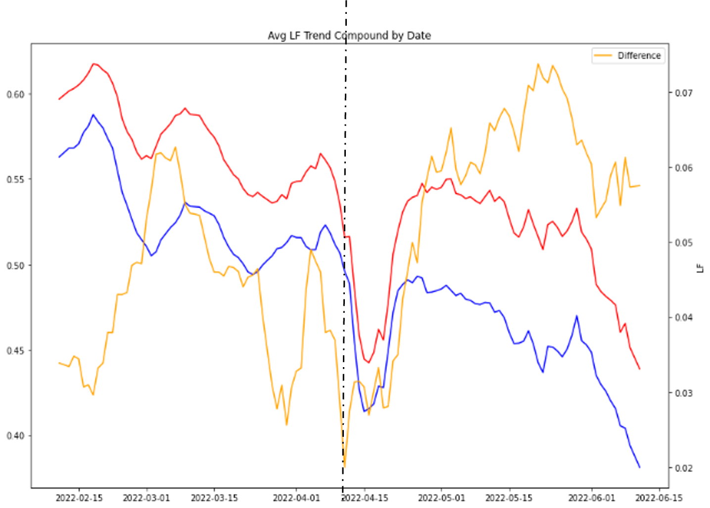
The difference may not be huge, but in the context of our vision, this is an amazing effect: For every other group exercise class with a waiting list, an extra member is participating, becoming healther and happier in the process.